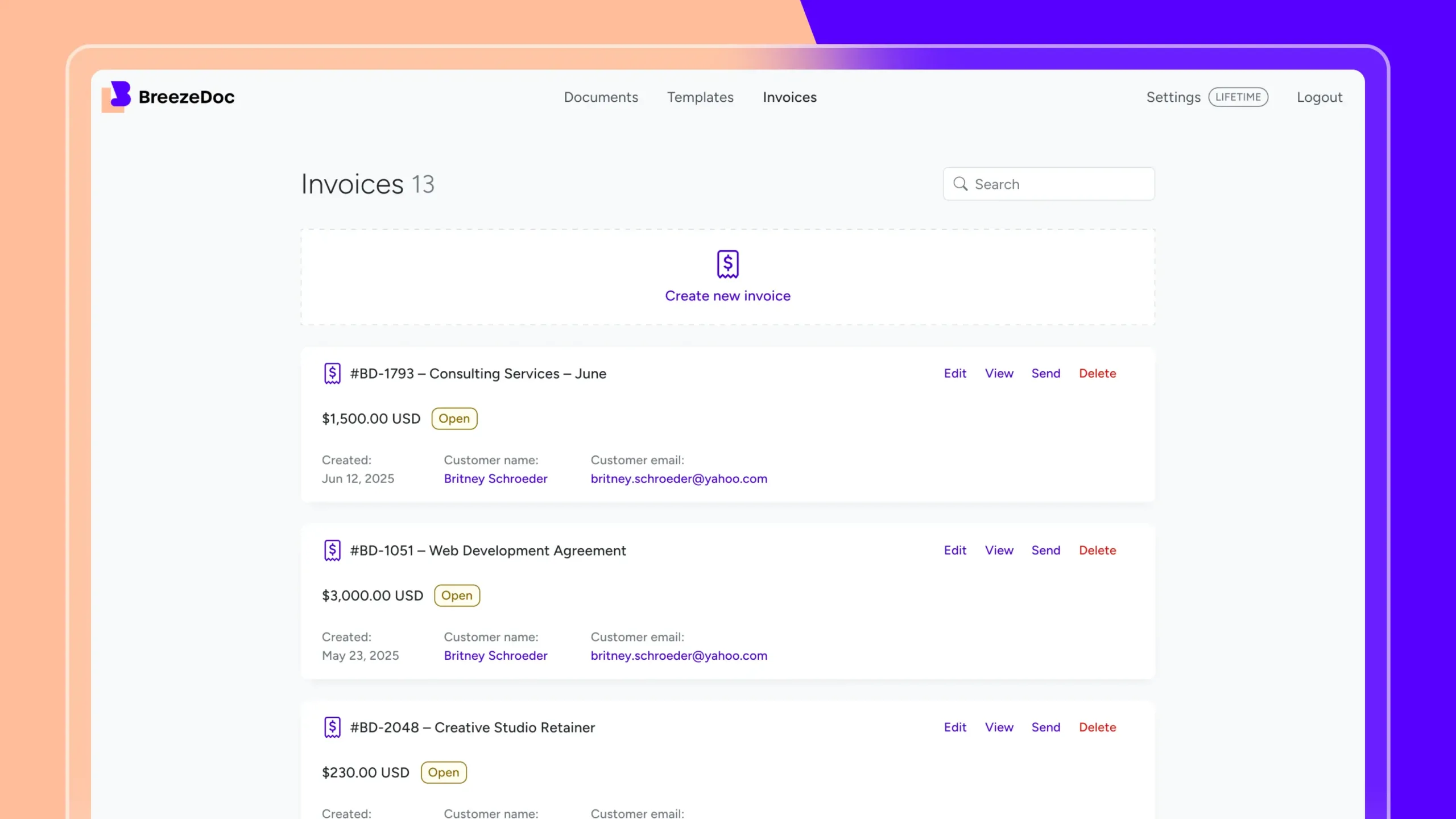
 Breezedoc, AppSumo Original Product
We didn’t just want users to create invoices. We wanted them to get paid, automatically, securely, and fast.
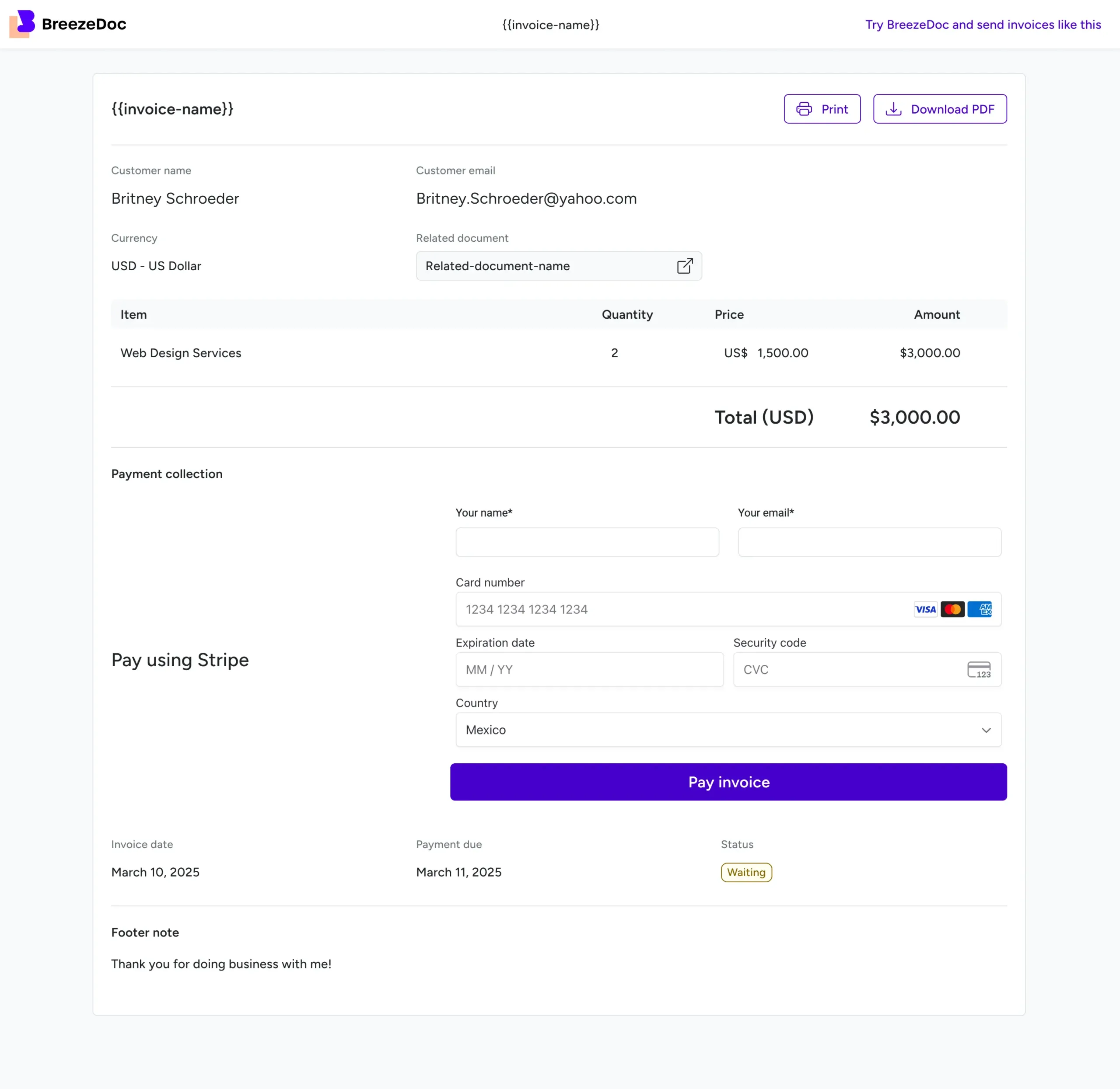
So I designed a clean, Stripe-powered flow:
Stripe would handle the PDF, the emails, and the payment sync. Technically, it was solid.
But there was one big catch: you had to connect a Stripe account to start creating invoices.
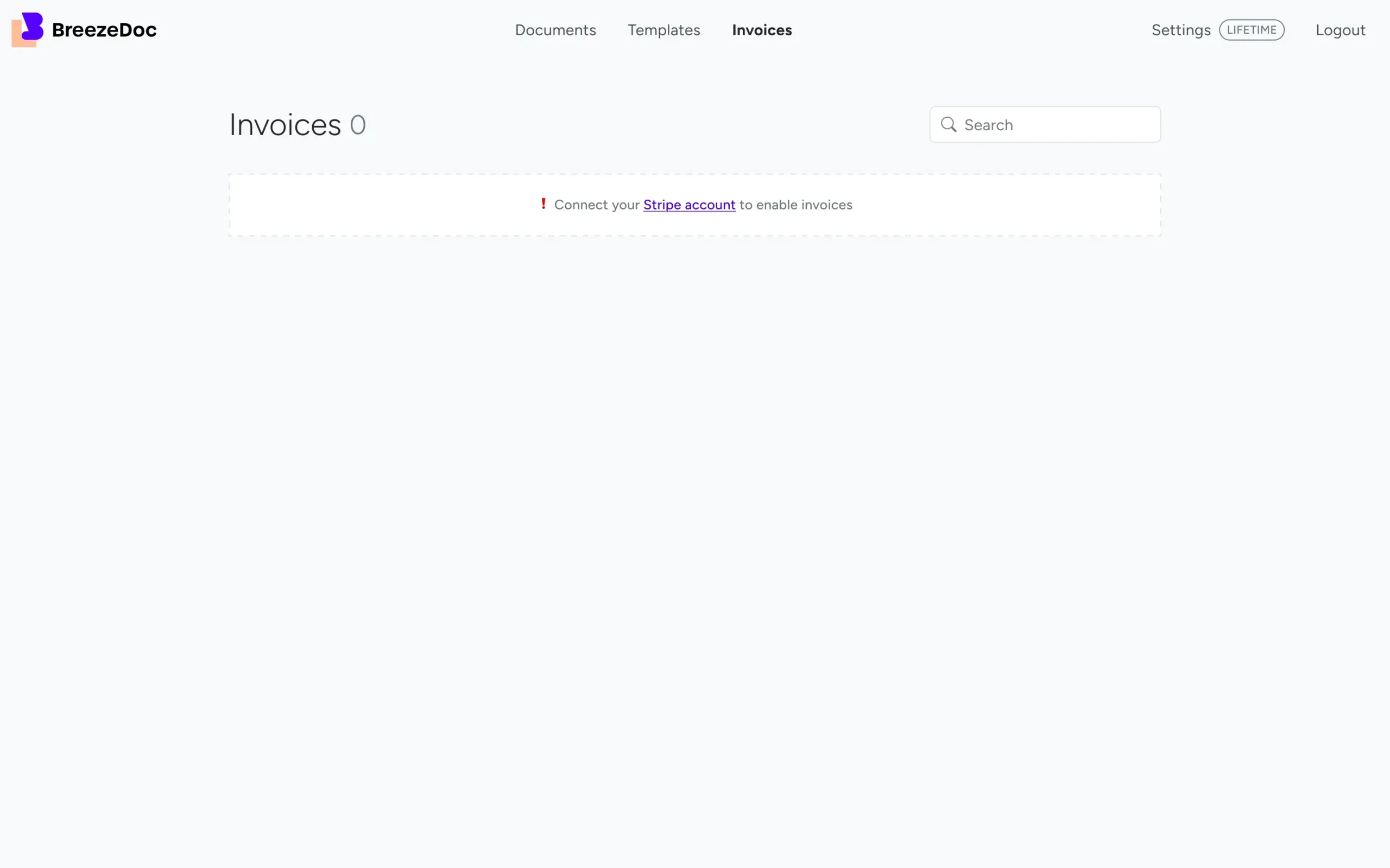
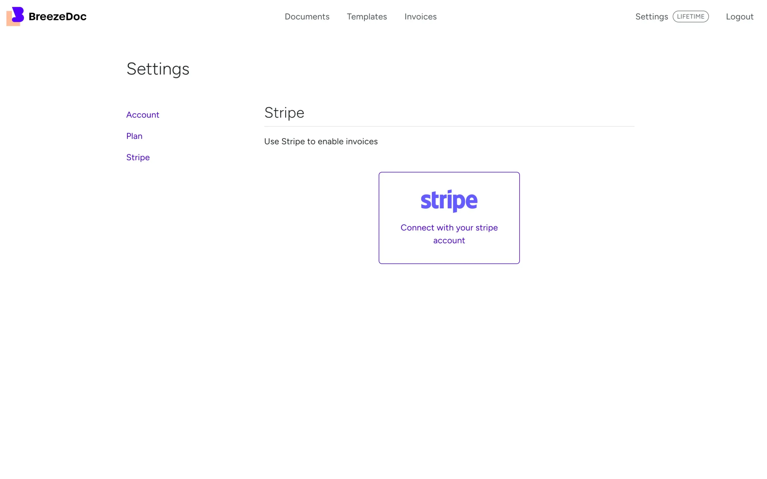
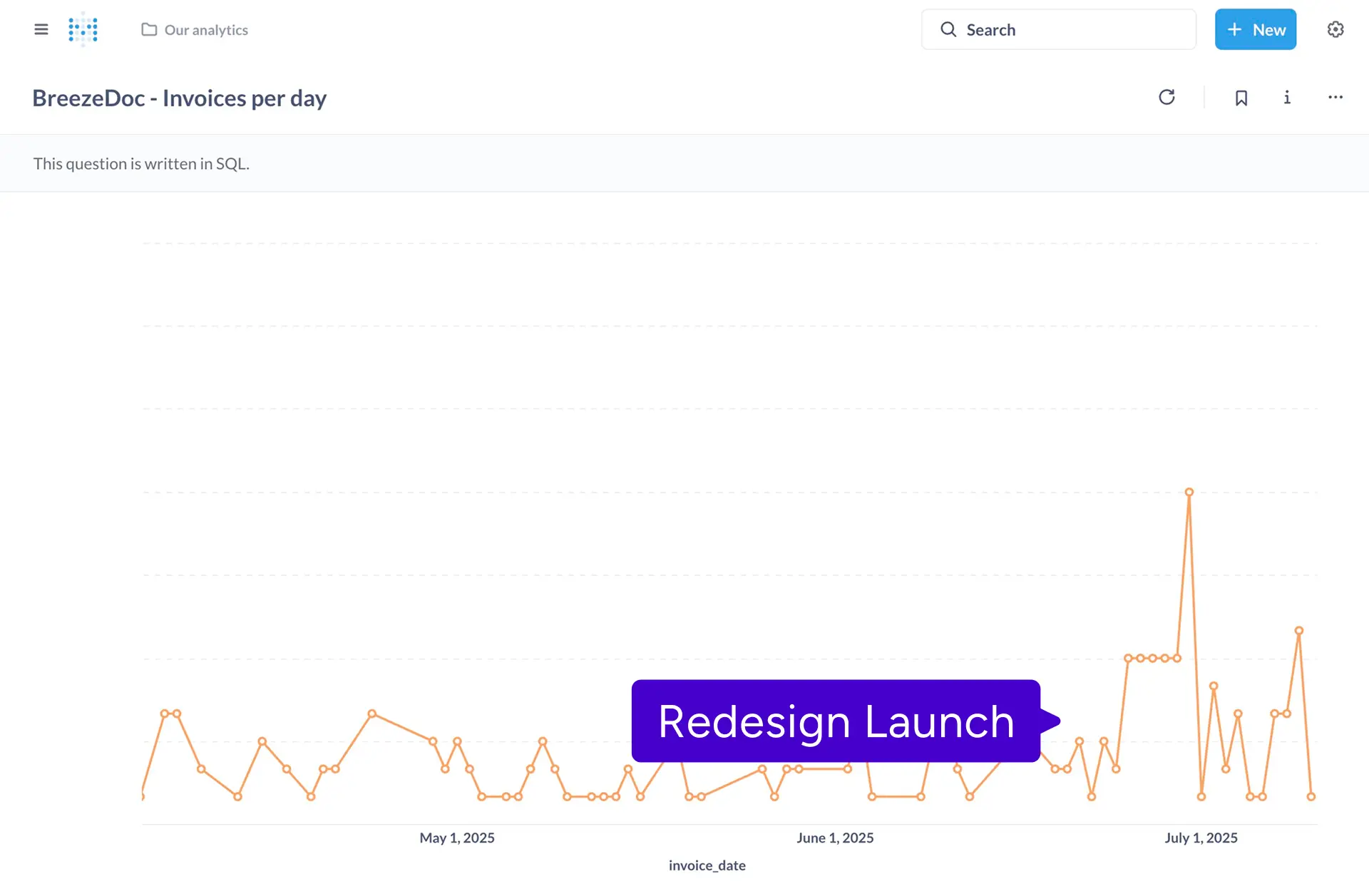
When the feature launched, usage was way lower than expected.
From user feedback and session recordings, the pattern was clear:
“I just need to send an invoice. Why do I need Stripe?”
“I don’t have a Stripe account. Can I just download a PDF?”
“This feels complicated. I’ll keep with what I know.”
The mandatory Stripe connection created a wall instead of a bridge.
That’s when I realized: my focus on integration made things more complex, not simpler.

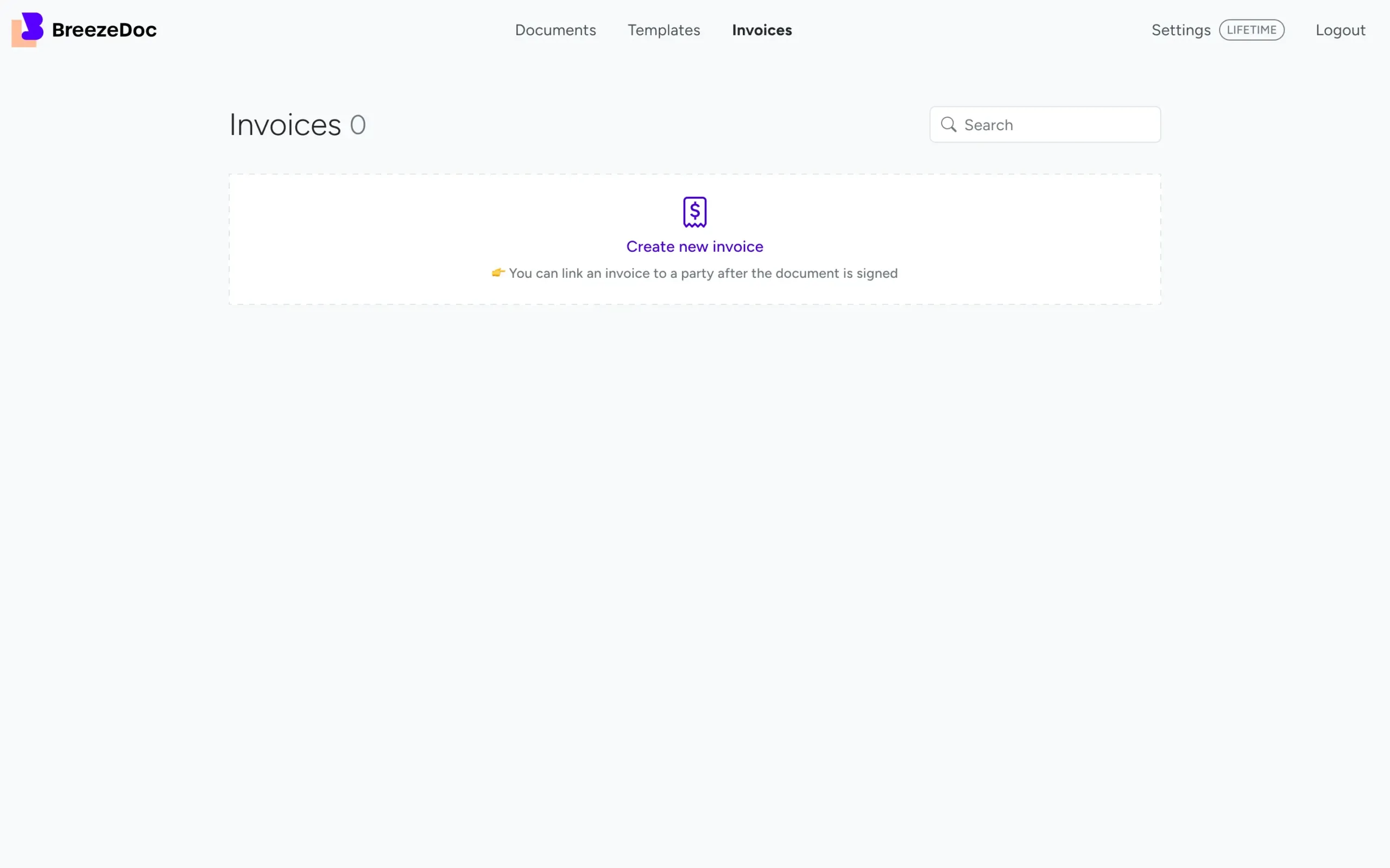
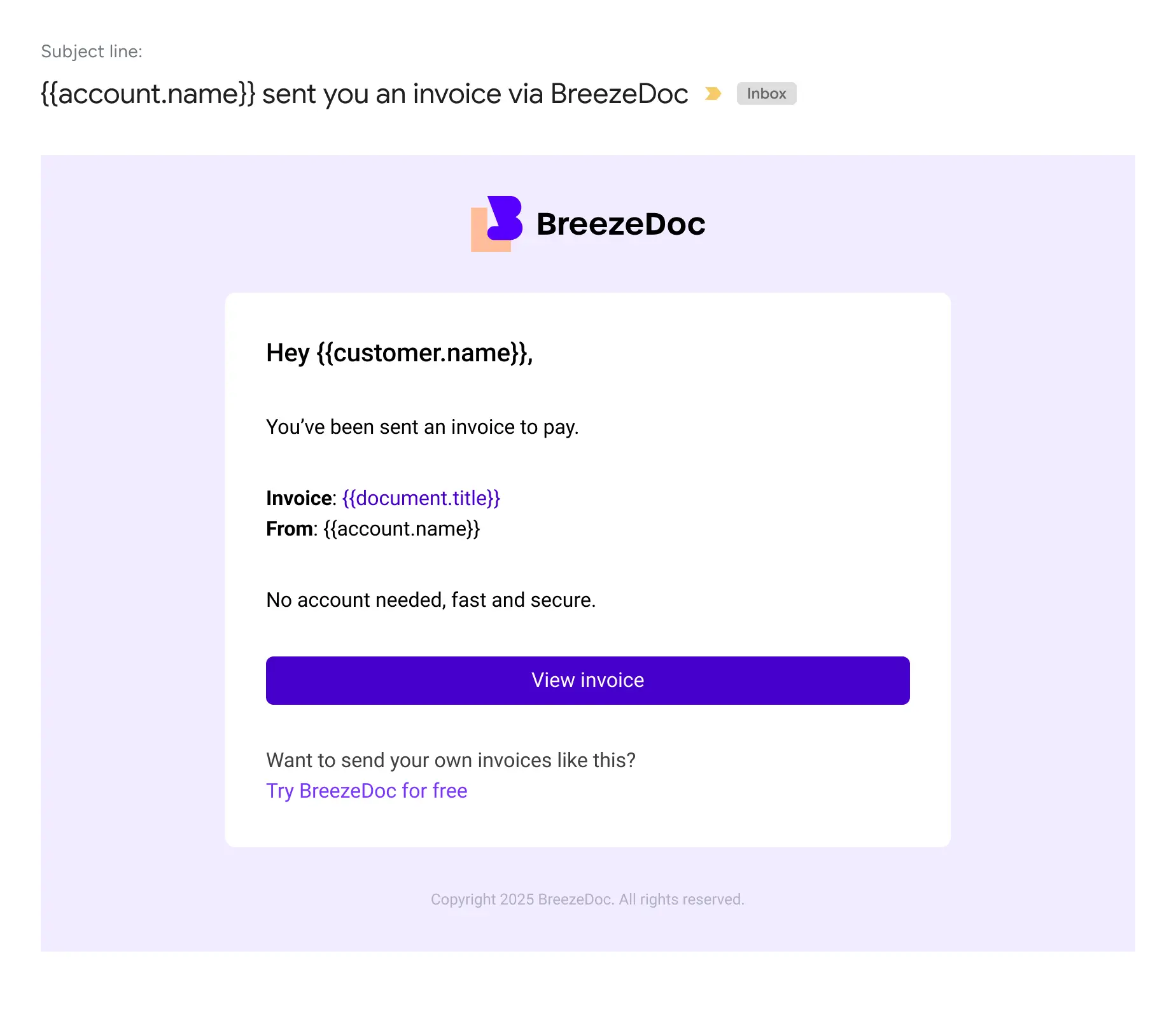
I decided to rebuild the experience from the ground up, with zero setup required.
Here’s what changed:
The UX became flexible:
Start simple. Get paid later. No blockers.
This only takes one week from rethinking to deployment
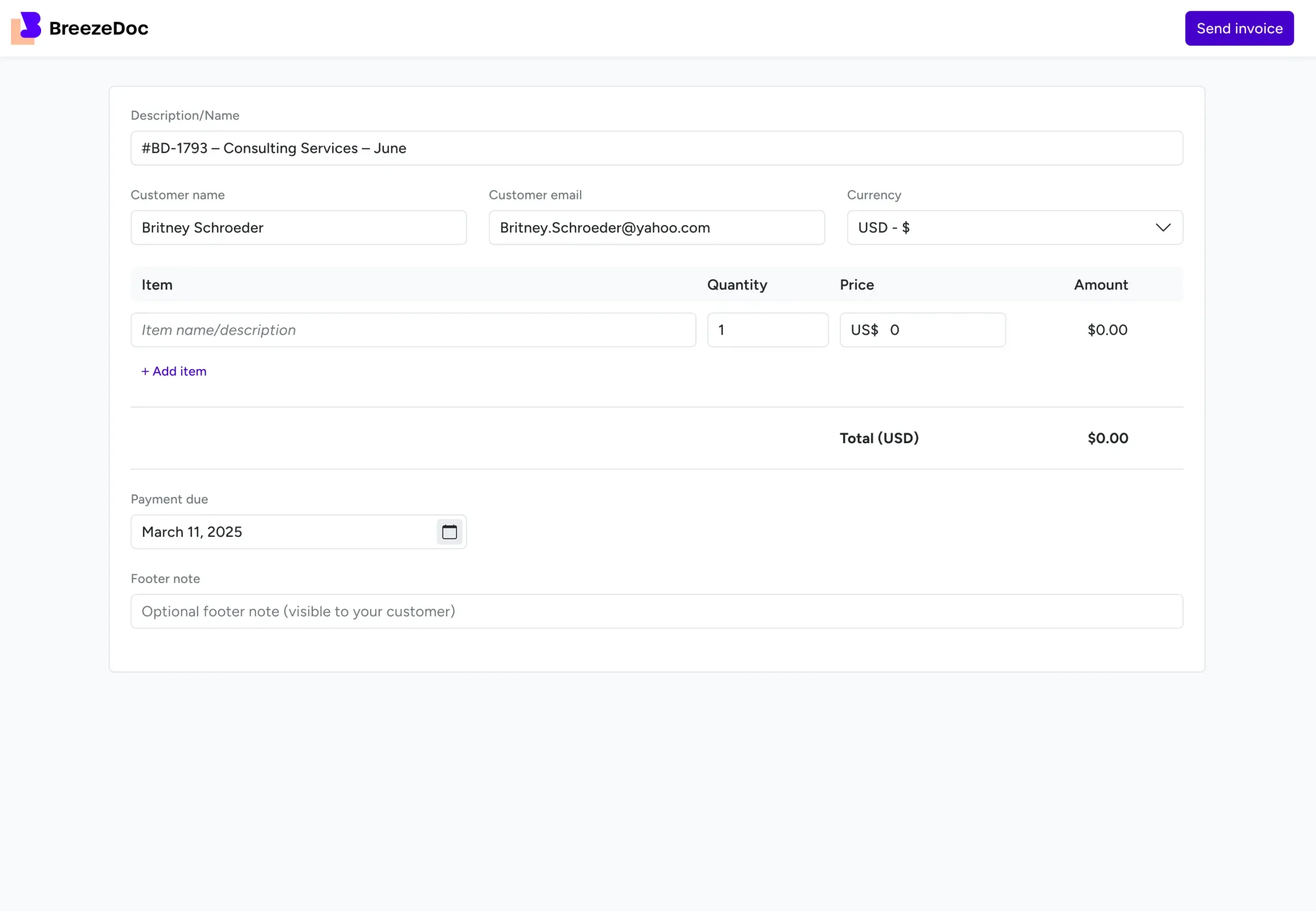
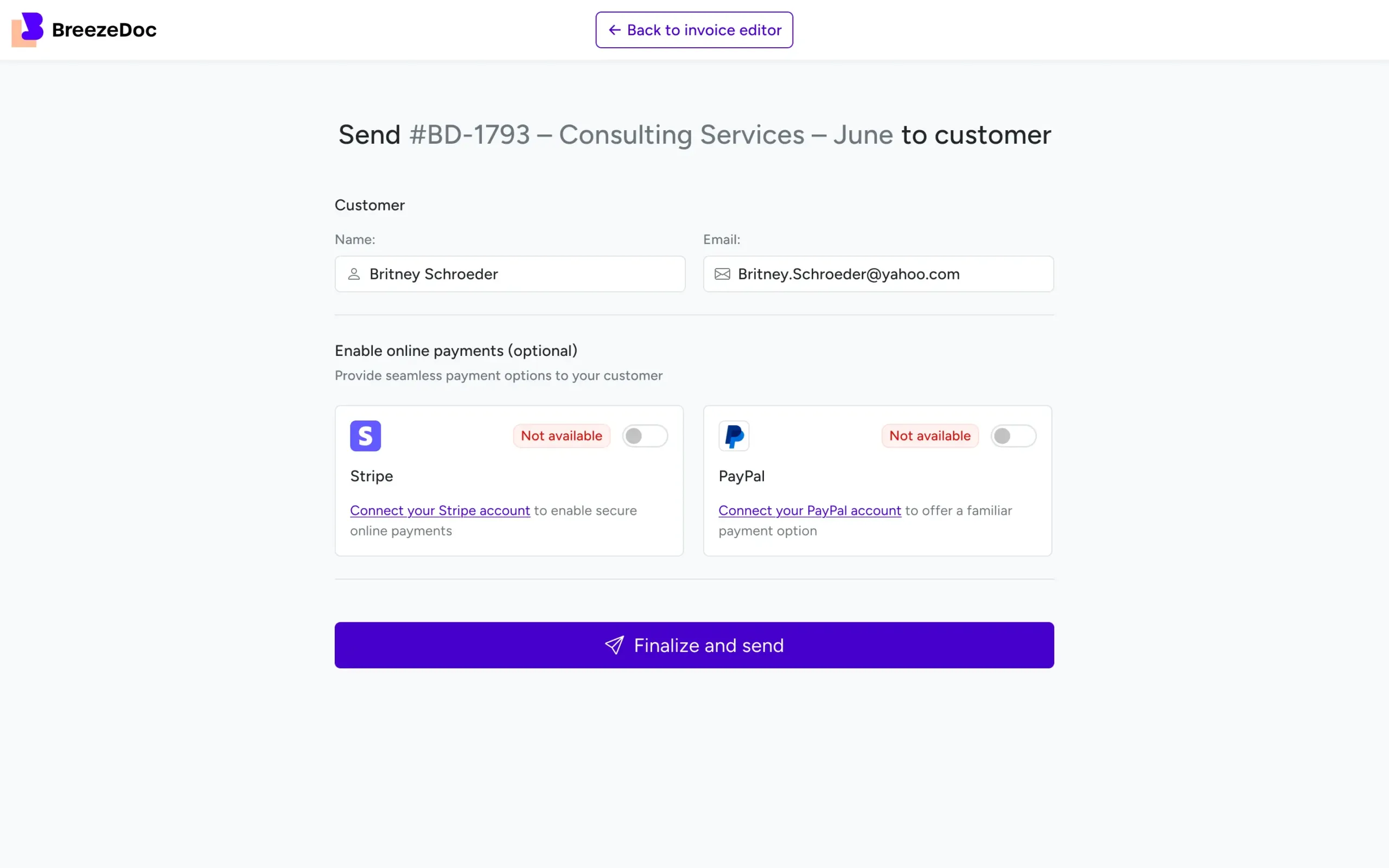
The shift worked.
I had turned a blocker into a feature.
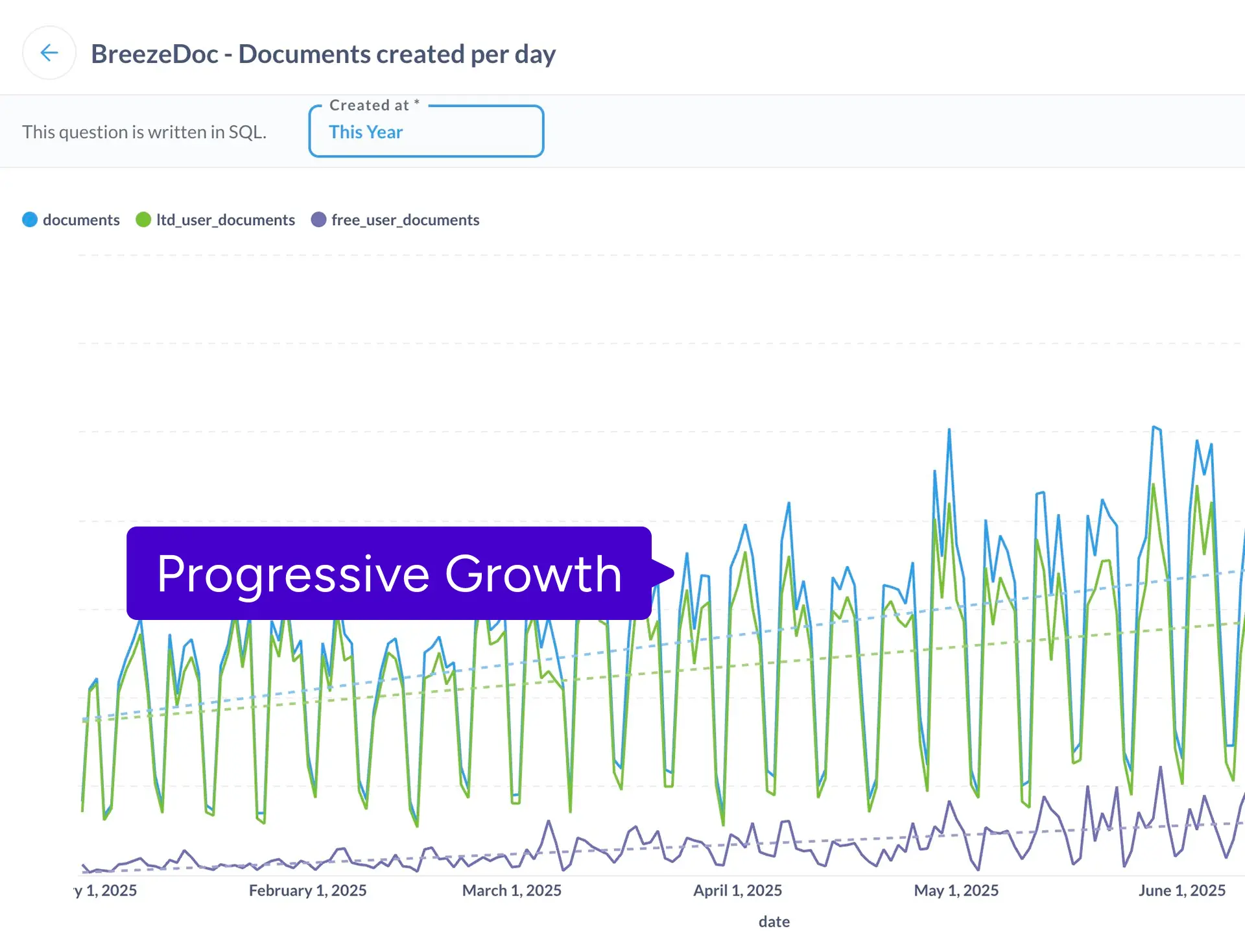
Looking back, I was too focused on technical elegance. I overestimated how many users wanted instant Stripe-powered automation, and underestimated how many just needed something quick and simple.
But I’m proud of how fast I iterated and turned failure into traction.

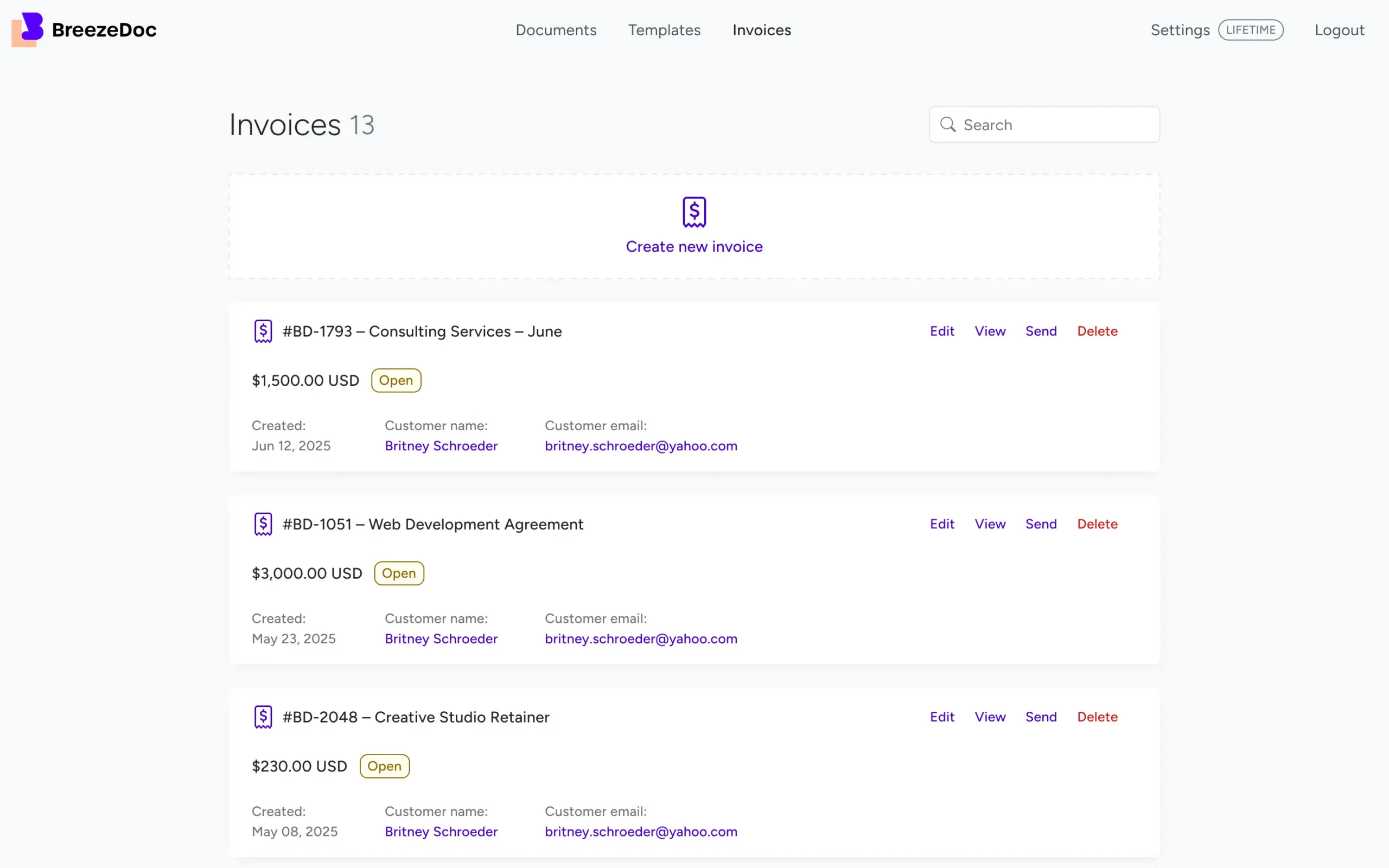
My work on the Invoices feature was just one part of a broader effort at BreezeDoc. In a span of only five months, our team shipped over 20 new features, each aimed at improving how people send, sign, and manage documents.
From core workflow improvements to small UX wins, I played a key role in designing, validating, and launching solutions that had real impact. It was an intense, fast-moving environment, one that sharpened my ability to prioritize, collaborate across teams, and move from idea to execution without losing quality.
This experience strengthened my belief that great design isn’t just about vision, it’s about shipping value at speed, without losing sight of the people using your product.